


RISD Museum Rebranding
While at RISD I took a summer identity design course; we were tasked with the rebranding of the RISD Museum. When it came time to bind our finished brand identity manuals, I wanted to take a different approach than my classmates; instead of printing out a design, I decided to use the alluring letterpress on the third floor of the Design Center that had been calling my name since I stepped foot in the building.
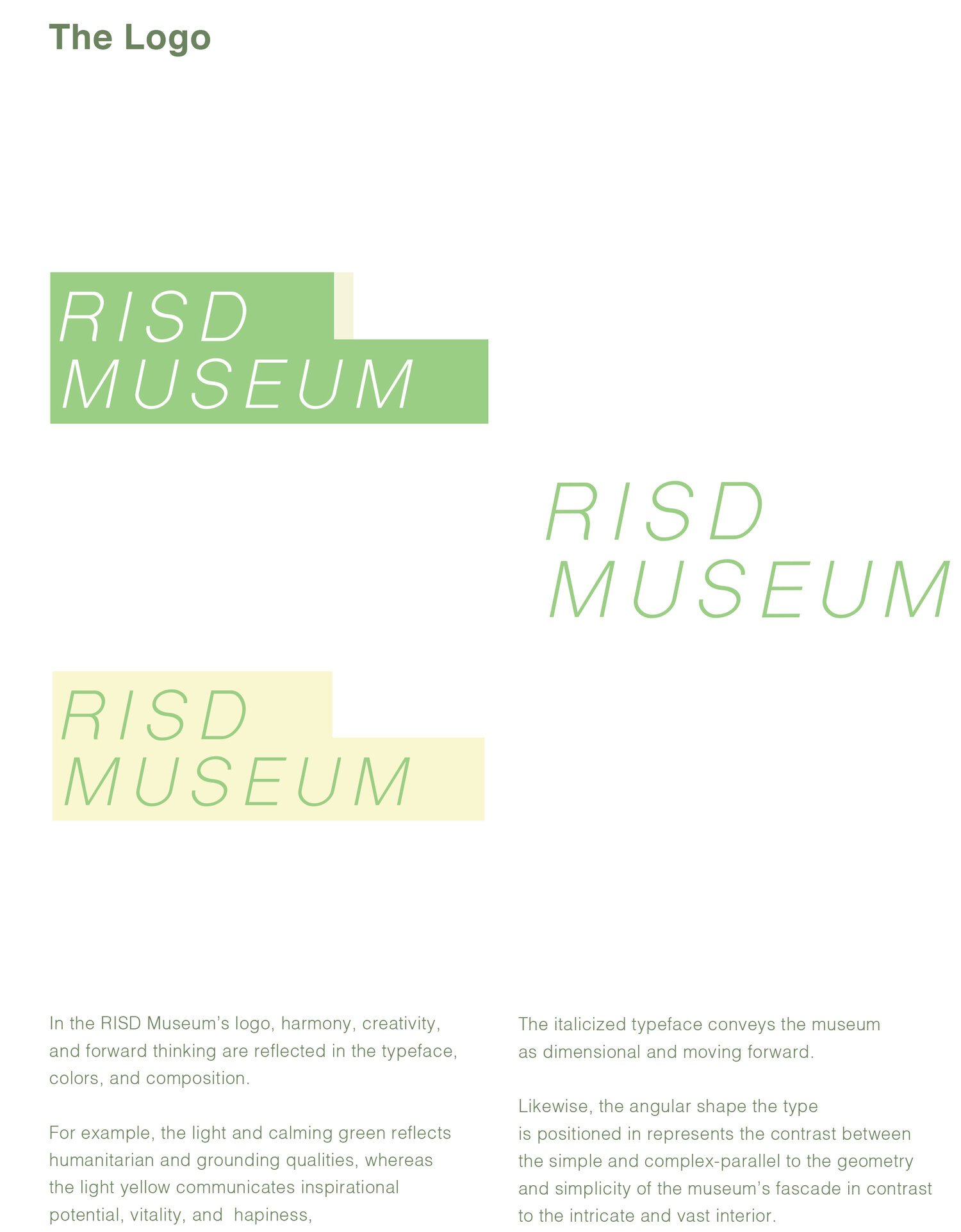
Juxtaposing the older style of printing, the letterpress, with the new identity within the manual not only reinforced the harmony between old and new in the RISD Museum, but also was inviting, expressive, and informative - more attributes of the museum.
Seeing as the colors of my logo are a very light yellow and light lime green, I thought it was fitting to use corresponding paper colors.
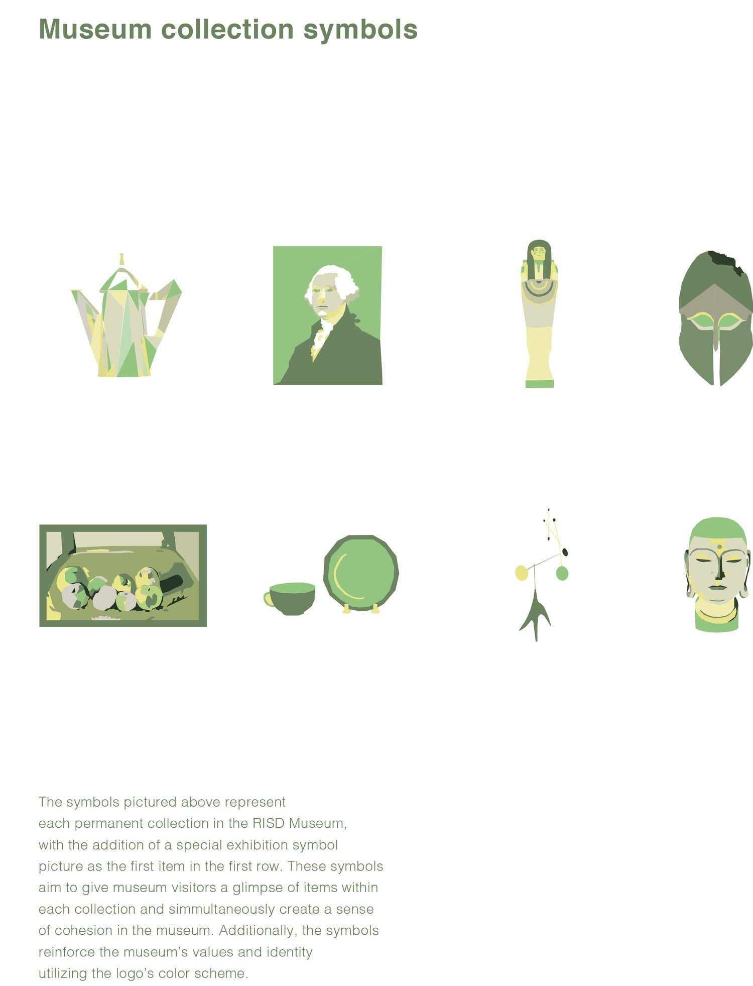
This is a page from my RISD Museum brand identity manual that shows 4 out of the 8 signs I chose to create for the RISD Museums exhibits. My process creating the collection of signs included research inside the RISD Museum, on the museum's website, intentional selection of quintessential works of art from the corresponding collection, and hand drawn vector art using tints and shades of the new logo colors.
In addition to the posters, the 8 icons I created initially can be placed on museum guides, directories, stickers, and other museum identity material. Further, since the art is vector based, the colors can be altered based on season, special events, and etc. reinforcing their versatility and timelessness.
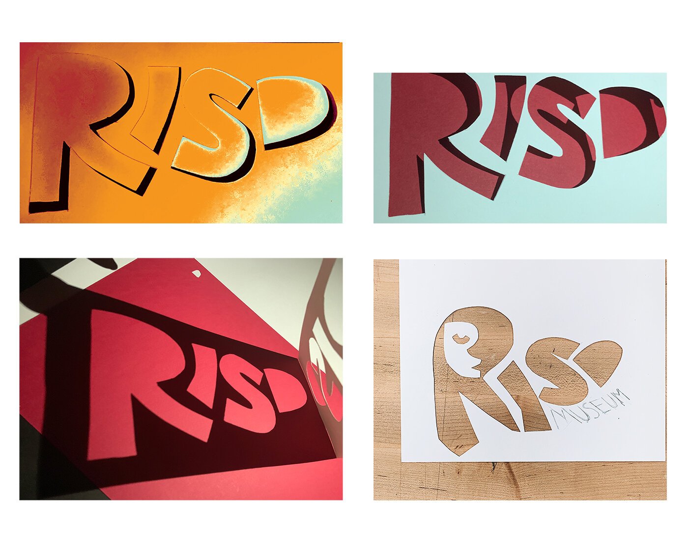
While brainstorming ideas from my many visits to the RISD museum and its surrounding area, I was inspired to explore a variety of different hand crafted methods.
I think it was seeing all of the inspirational work by artists and students in the RISD Museum that drew me to physically making some logos, or perhaps it was my natural gravitation towards experimenting with tangible things that compelled me to hand cut dozens of letters and experiment in the photo lab.
In the end I ended up selecting a graphic logo for the main museum, and with the hand cut letters, I created a hypothetical event held by the RISD Museum that was more suitable to the playful qualities of these logos.
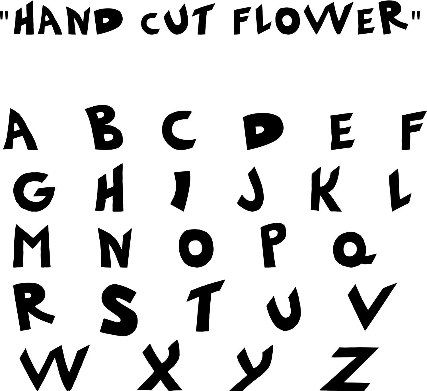
This hand cut font is based on the initial "R" "I" "S" "D" I created when brainstorming logo ideas. The terminals are sharp and the tone is dynamic and playful, thus I decided to name it "Hand Cut Flower" after the way flower stems look when they are cut (also the meaning doubles because it is a hand cut typeface).
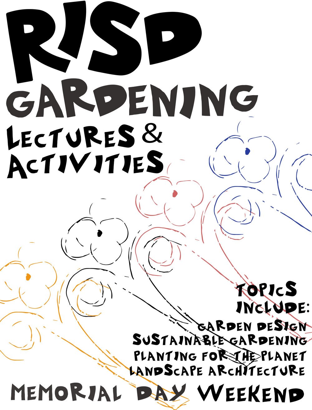
The RISD Museum's hypothetical Gardening Lecture Series seemed to be a perfect fit for the typeface. One of three posters I made for the event can be seen on the proceeding page.